
Brand guide · v1.0

One studio. Two design languages.

Creative Blaq Studios builds two kinds of things: professional apps for real people, and tools for developers. They share one mark and one orange, and speak in two voices.

01 · Logo & mark

The Cb mark.

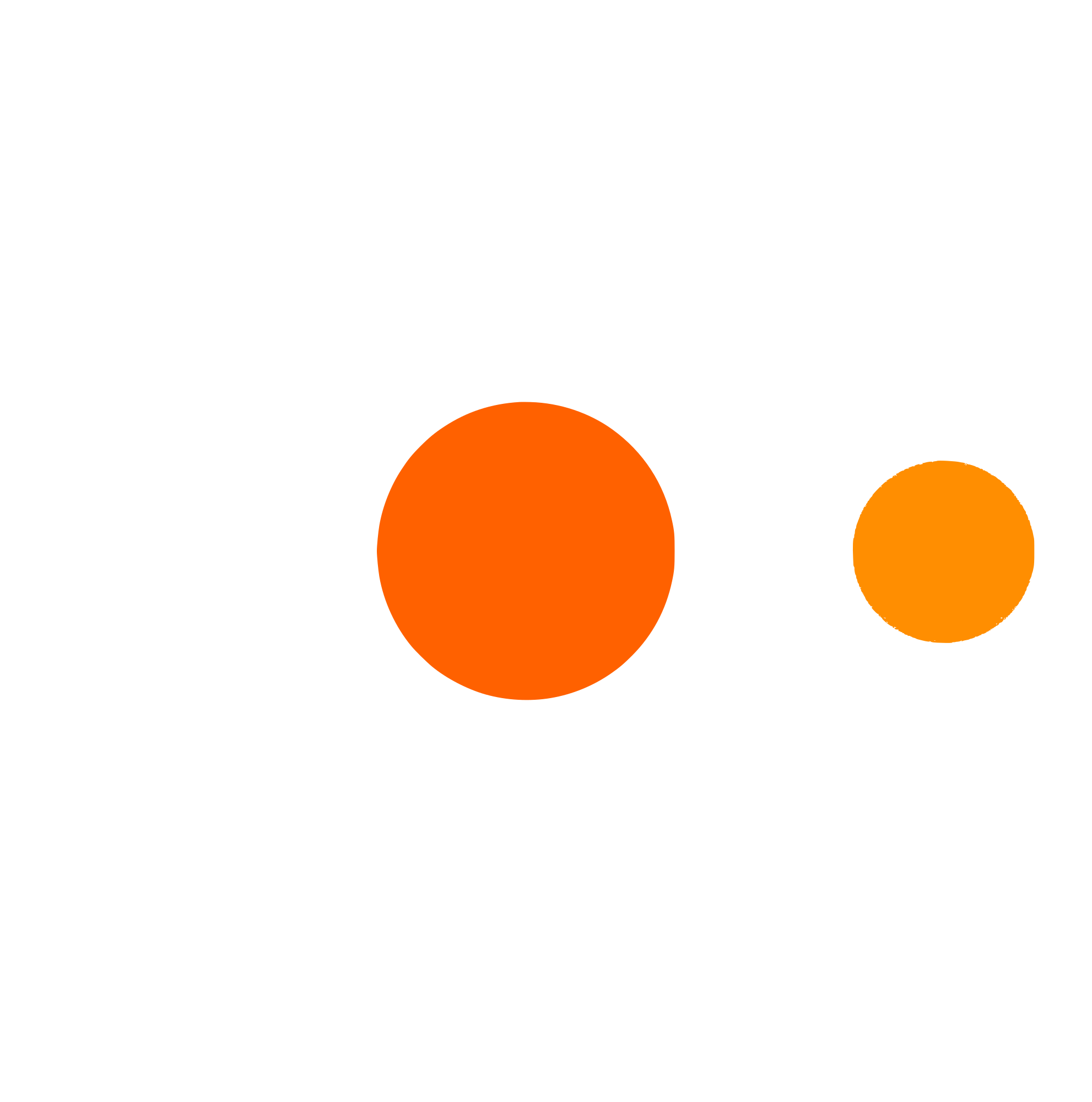
The Cb monogram is the parent mark shared by both divisions. Use the black mark on light backgrounds and the white mark on dark ones. The orange dots are always present.

On light backgrounds · cb_mark_black.svg
On dark backgrounds · cb_mark_white.svg

Minimum size

Never smaller than 24px on screen or 8mm in print. The b-bowl and the gap between the dots must stay legible.

Clear space

Keep clear space equal to the height of the small orange dot on every side. Nothing else enters that zone.

Never

Never rotate the mark. Never change the dot colours. Never put the black mark on dark or the white mark on light.

File formats

Always use SVG on screen. Export PNG at 2x only where raster is required. The SVG is the source of truth; never trace a screenshot.

02 · Architecture

Two divisions.

Division A

Blaq Studio

Professional apps for real people. Light-first.

The competent colleague.

The interface should feel like working alongside someone organised and sharp who never wastes your time. Guide without patronising. Inform without overwhelming.

  1. Clarity over cleverness. No one should wonder what a button does. Labels are actions, not nouns.
  2. Structure is invisible. Grids organise everything, but people see clean space, not graph paper.
  3. Defaults are opinions. Don’t present blank slates. Make the smart choice and let people override it.

// division b

BLAQ DEV

// developer tools, packages, cli. dark-first.

THE SENIOR ARCHITECT.

Our tools are used by engineers who read source before docs. The interface signals competence, not friendliness. Grids are visible. Corners are sharp. Code is content.

  1. Code is the UI. README banners, inline snippets and syntax highlighting are first-class design elements.
  2. Grids are visible. The structure is celebrated, not hidden. Blueprint paper, not a blank canvas.
  3. Zero ornament. No gradients, no illustrations, no drop shadows. Information is the decoration.

03 · Colour

Orange means action.

Studio is light-first; dark mode is offered but never assumed, and the orange is reserved for primary actions, never decoration. Dev is dark-first, and its syntax colours are part of the palette. Click any swatch to copy its hex.

Blaq Studio · light

Blaq Studio · dark (optional)

Blaq Dev · core

Blaq Dev · syntax

04 · Typography

Type is tone.

Blaq Studio

Display · Outfit 700–900 · Title CaseA Product Studio That Ships
Body & UI · Instrument Sans 400–600 · Sentence caseParagraphs, labels, buttons and navigation. Optimised for sustained reading, never more than 65 characters a line.
Data · JetBrains Mono 400–500 · numbers, IDs and dates onlyR 24,850.00 · v1.2.0 · 2026-09-23

BLAQ DEV

// display · outfit 900 · all capsZero Boilerplate
// body · outfit 400 · deliberately smallReactive state management built for scale. Strict type integrity. Minimal rebuild overhead.
// code + ui · jetbrains mono · the default voiceclass BlaqState<T> extends Observable { // immutable by default }

05 · Voice & tone

Two voices.

Direct but warm.

Write like a competent colleague, not a marketer and not a robot. Every word earns its place. Be honest about errors.

Do

  • “Save together. See everything.”
  • “Sync failed — check your connection and retry.”
  • “Add your first project to get started.”

Not this

  • “Our innovative, AI-powered solution empowers your team to unlock operational excellence!”
  • “Oops! Something went wrong. Please try again later.”
  • “Welcome to your journey! Let’s set things up.”

SURGICAL. ZERO FLUFF.

// write like an engineer drafting a blueprint. what it does. how to install it. code first, explanation second. no exclamation marks in docs.

// correct

  • “Reactive state management. Zero boilerplate. Strict type integrity.”
  • “Breaking: removed deprecated `observe()`. Use `watch()` instead.”
  • “Install → Import → Configure. Three steps. No setup wizards.”

// incorrect

  • “Hey! This awesome package makes state management super easy and fun!”
  • “We’re excited to announce some amazing new features!”
  • “Getting started is a breeze — just follow these simple steps!”

06 · Spacing & shape

Generous breathing room.

Studio products follow a 4px spacing scale, and generous whitespace signals confidence. Corners are subtly rounded at 6–10px. Dev surfaces keep them sharp.

4
8
12
16
24
32
48
64